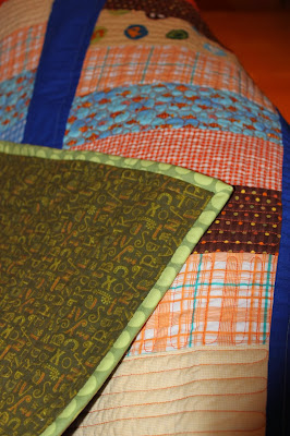
After my Girly Girl Quilt and all that pink, I really wanted to work on something a bit more boyish. So I present to you... Boyish Boy Quilt! (Temporary name, I am sure I can come up with something better!)
I just put the last stitches minutes ago and I was too eager to wait until I could take outside pictures.
There are lots of things I like in this quilt, starting with the colours. They are not colours I work with a lot, but when I pulled the fat quarters out of the stash, I thought the orange, blue, green and brown mix was a lot of fun.
I also love the quilting I did on the "bricks". Most of them are back and forth lines, but I did include some pebbles. I love the look of pebbles, but find the process quite tedious so I knew I did not want to do too much of those. I had four bricks of that fish print, so I only quilted pebbles in those four bricks.
I used thread from Connecting Threads which is a great weight when you want your quilting to stand out a bit.
Finally I love the backing, which is mostly in a green flannel print, also from Connecting Threads, and the binding which I think is an Amy Butler print.
There are, however a couple things I do not like about this quilt. I debated how to quilt the blue sashing. I thought the orange would be overpowering and I did not have blue, so I opted for green. I had the perfect shade in Connecting Thread but for some odd reason, I chose to go with Aurifil instead (50wt). What a disaster! Now, I love Aurifil, it's my favourite thread. It just was not the right thread for this project.
I thought I would experiment with different weights, but by the time I realized it was not working, I was to far into it and I did not want to unpick. You see, I did not change my stitch length from the default which is good for piecing, but way too small for quilting. I also used my walking foot, but I think I should have free-motioned the lines to give them a more "organic" look, similar to the lines in the bricks.
Another thing that bugs me about this project is that although I carefully planned the rows so that no two similar bricks would be aligned, I somehow reversed my middle strip and ended up with not two, but three similar blue bricks in one row! Arghhhhh!
For all its flaws, I am still pretty pleased with the overall result. Once it's washed and crinkly, the quilting might not look as bad, and I am sure once that whoever ends up being the final recipient of that quilt won't see it with the same critical eye as I do.
So... what have you been working on?
Linking up to TGIFF at Quilt Matters.


Looks great! Love those bright colours!
ReplyDeleteWe are always our toughest critics, eh? I never would have noticed those things, Dom. Fun colour palette too -- way to go, Dom!
ReplyDeleteI love the prints you've used there - and you already know I'm a fan of the colour palette. Never would have noticed the three blue bars lining up if you hadn't pointed it out, though.
ReplyDelete