Happy Friday night everyone!
I have had fun playing with the colours blue and green lately..

It started with the pouch I made for our swap with MQG Victoria...

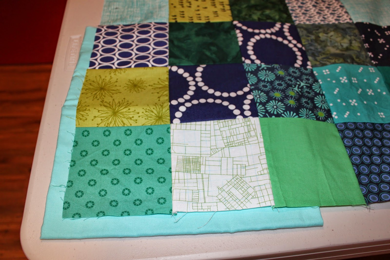
But I wasn't done with that combo. One evening, I just started cutting 4 1/2" squares to make a Blue and green baby size quilt. Blue, green, aqua and teal squares, solids, batiks, large prints and small prints... my only rules for fabrics were: no other colours (other than white) and no flowers or girly patterns.

As for placement, I did not overthink this, I only avoided similar fabrics next to one another. Overall, my random method worked out, although I do see my four squares of solid royal blue are all in the top right side. I am now trying to decide on binding, and here is where you come in. Please voice your opinion!
1 - Should I go dark wavy stripes:

2 - Or a geometrical print in a lighter tone:

3 - Or perhaps a solid teal:

4 - or even a light aqua? (not really feeling this one):
What do you think? Perhaps it would help to see what I have in mind for the backing: Sunglasses wearing dolphins! Yup! You read that well!

I know, I know! One minute I think these dolphins are really cool. Then look at it again and think they are kind of freaky! The fabrics used for the top are mostly graphic and geometrical, quite different from this novelty print. It isn't very baby-ish. Heck, it might even scare babies! But... it is in the right colour scheme (despite those coloured sunglasses), it's been in my stash for about 10 years, and I have about 3 yards of the darn thing! Feel free to try to talk me out of it, but at the end of the day, the bizarre sunglasses wearing dolphins are probably here to stay!

I like the wavy first binding and the dolphins make me smile. :)
ReplyDeleteI vote dark wavy stripes for sure. Cute baby quilt top!
ReplyDeleteI like #1 or #2. The dophins are freaky, but they are also kinda cool.
ReplyDeleteoooo - The dark wavy stripes!! Love the dolphins for this backing. They're not freaky! ;D
ReplyDeleteFun colour scheme! Glad I'm not the only one who finds themselves working in a series when it comes to colours. I vote for 1 or 3 and say go for it with those dolphins! They are wild!
ReplyDeleteI like the dark teal solid. I am loving this blue green combo so much. A great little quilt.
ReplyDelete2 or 3 I say
ReplyDeleteLove the top and love the back. Those dolphins are fabulous! #2 is my first choice and #1 is second.
ReplyDeleteIf it's not too late for an opinion, either dark wavy stripes or the solid teal. Crazy dolphin back is awesome!
ReplyDeleteI vote for the first one! And I think the back is fabulous!
ReplyDelete